Cleveland comes up first is because their current overall aesthetic is not all bad; rather, parts of their identity look like they’re starting to take shape. But there are still some things that need work.
If you perform a Google image search for the query “cleveland cavaliers jersey history,” you will see the prime example of an organization who has no idea what they are doing or what they want to be. Simply scroll down to see a myriad of completely unrelated uniforms. The only common theme from one to the other is that they are all hideously ugly. In addition, their designs rarely acknowledge the team’s name thematically.
Yes, this team has run the gamut of awful design and diluted their brand in the process. But luckily their current uniforms–which hearken back to their inaugural look–are totally sweet (take notice of this, Toronto Raptors!). So while there is hope, the history of this team should also tell us not to get too attached, as something completely different could be looming in the not-so-distant future.

Being that this series is focused on current NBA design aesthetics, I will save myself from delving too deeply into Cleveland’s dark design past. I promise only to summon as much information as I need to rip into their current logo.
For a team like Cleveland, their frantic design history is vital in understanding what’s going on with today’s current aesthetic. After horrendously handling black, blue and orange for the better part of 30 years, the team has finally reverted to its inaugural colors, a classic combination of wine and gold.
There are currently no other teams in the NBA that use these colors, so good on the Cavs for making use of a timeless combination to set themselves apart from the pack.
But the team’s uniform struggles have carried problems with primary logos in tow. As pictured above, the team’s inaugural design is comparable to the original Tampa Bay Buccaneers original logo. Though the Bucs’ old jerseys and logo are now considered classic, the Cavs ditched their logo without trying to revamp it first. They had all the pieces they needed to develop themselves into a classic organization. But instead, they did this:

I understand that every basketball team is obsessed with telling us what sport they play with their logo. But why not tell us what is unique about your team? Or better yet, what your team name actually means? Aside from their original logo, the Cavaliers organization has done nothing to educate people about what a cavalier actually is. Subsequent designs have been devoid of any context that could help people figure it out. Is a cavalier a triangular basketball hoop that doesn’t give you the ball back after you make a shot? Doesn’t sound like fun to me.
To make matters worse, this era in Cavs history showed us how unpredictable and senseless the organization could be. Choosing to completely abandon their potential-filled original logo, the team decided to stick with this second logo for far too long, and even tried out these meaningless uniforms.

Then in 2003, the Cavaliers organization finally “came to their senses” and dropped this aesthetic. But it wasn’t much of an improvement…This new design would still be one of the worst in the league.

Close to the original colors, but whoever thought these two colors complimented one another was in the wrong line of business. Thankfully we did get a sword back in the mix on the side panel of the shorts, but a cavalier is not a sword. Nevertheless, it’s progress.

Wrap Up
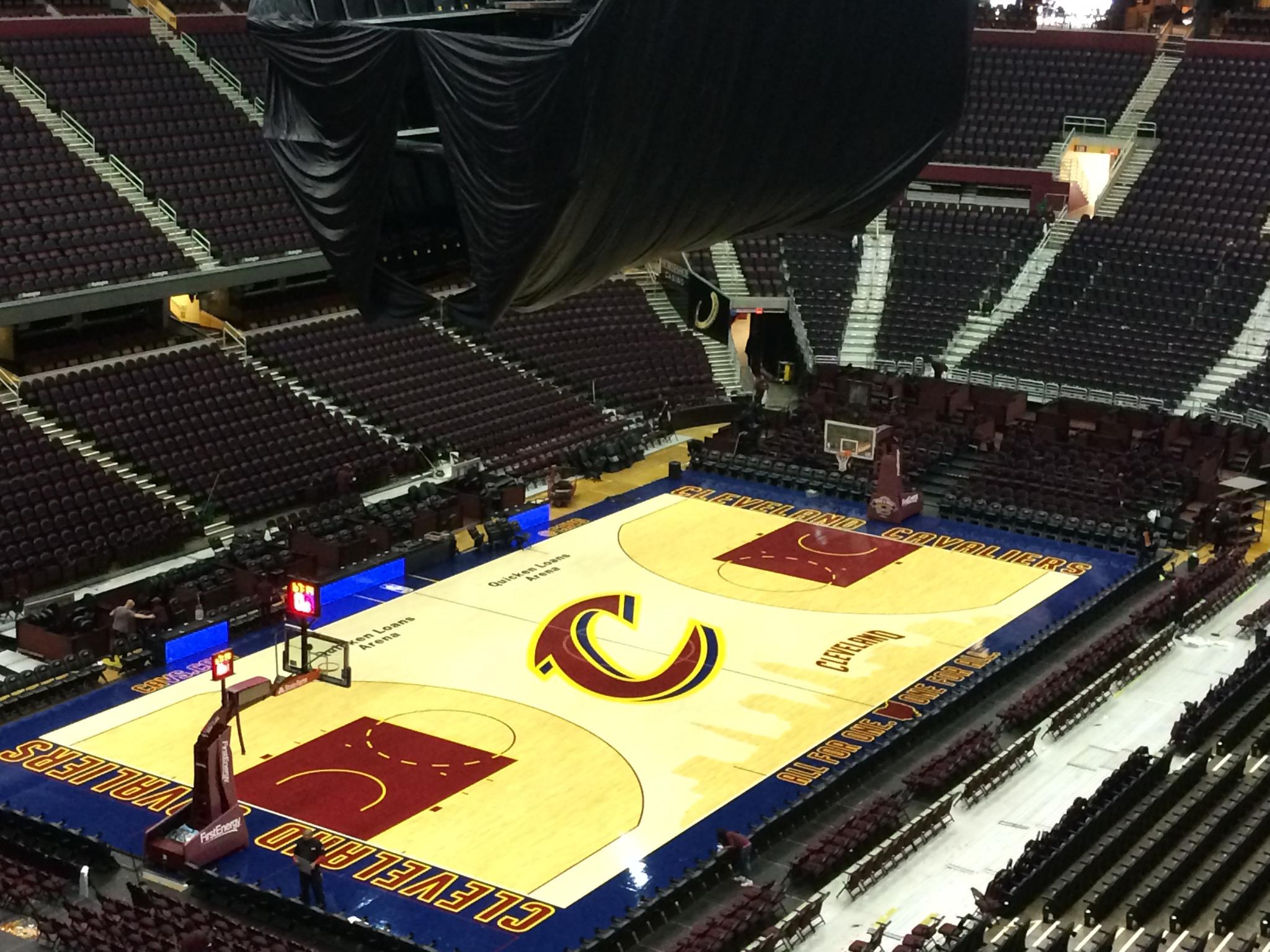
The Cavs get credit for currently having a cool looking uniform, but their overall aesthetic is not great. The team’s logo is mediocre at best, and the team’s court design is lackluster. Granted, the franchise has a long history of terrible design. It is amazing how many radically different designs they have tried out. The Cavaliers’ attempts at redesigning their team’s image has done nothing to develop or improve upon a lasting aesthetic that the franchise can stand behind. They are onto something with their current uniforms, but part of that is because their logo, or the font used therein, is not featured on them.
